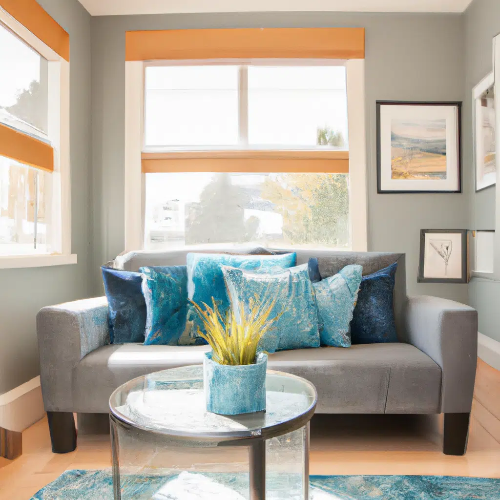
The Top Color Rules for Creating a Cohesive and Stylish Home Design
When it comes to designing your home, one of the most important decisions you’ll make is choosing the right color scheme. The colors you choose will set the tone for your entire home and can have a huge impact on how you feel in each room. In this article, we’ll be sharing the top color rules for creating a cohesive and stylish home design.

Rule 1: Stick to a Limited Color Palette
One mistake many homeowners make is trying to incorporate too many colors into their home design. This can lead to a cluttered and chaotic look that’s not very pleasing to the eye. Instead, it’s recommended to stick to a limited color palette of 2-3 colors.
When choosing your colors, consider the mood you want to create in each room. For example, if you want a calming and peaceful bedroom, choose soft blues and greens. If you want a lively and energetic living room, choose bold reds and oranges.
Rule 2: Coordinate with Existing Elements
When choosing your color scheme, it’s important to consider the existing elements in your home. This includes things like your flooring, furniture, and artwork. You want to choose colors that coordinate well with these elements, rather than clash with them.
For example, if you have a hardwood floor with warm undertones, choose colors that also have warm undertones, such as yellows and oranges. If you have a neutral-colored sofa, choose accent colors that complement it, such as navy blue or emerald green.
Rule 3: Use Color to Define Spaces
Another way to create a cohesive and stylish home design is to use color to define different spaces in your home. This is especially useful in open-concept living spaces where there are no walls to separate areas.
For example, you could use a different color on the walls in your living room than in your dining room to visually separate the two spaces. You could also use a different accent color in each room to create a unique and cohesive look throughout your home.
Rule 4: Don’t Be Afraid to Mix and Match
While it’s important to stick to a limited color palette, that doesn’t mean you can’t mix and match different colors and patterns. In fact, incorporating different textures and patterns can add depth and interest to your home design.
When mixing and matching, choose patterns and colors that have a similar color palette or complement each other well. For example, you could pair a floral print with a geometric print in coordinating colors for a stylish and cohesive look.
Rule 5: Consider the Lighting
Finally, it’s important to consider the lighting in your home when choosing your color scheme. The lighting can have a huge impact on how your colors look, so it’s important to test them out in different lighting conditions.
For example, if you have a room with a lot of natural light, darker colors may look washed out. On the other hand, if you have a room with minimal lighting, darker colors may look too heavy and overwhelming.
Conclusion
In conclusion, choosing the right color scheme is crucial for creating a cohesive and stylish home design. Remember to stick to a limited color palette, coordinate with existing elements, use color to define spaces, mix and match patterns, and consider the lighting. With these top color rules in mind, you’ll be able to create a beautiful and inviting home that you’ll love spending time in.
